

What is a Responsive Website and Why do I need one?
/My business does not operate like it use to 5 or 10 years ago here in Cincinnati, Ohio. As technology changed so did how people connect and view my business. Years ago I advertised in the Yellow Pages. As consumers switch from home phones to smart phones now businesses need to advertise online as well as on mobile devices. I learned that 2015 was the year that most advertisers were now targeting Smartphones via the web. Paying attention to this, I realized that my old website did not meet all expectations of those looking for my services. I learned through an online company I did business with what a Responsive and Mobile Friendly Website is. I realized I needed one.
Shown below are two examples of what a Responsive Website is not! These are shown using my desktop web browser.

Old Website before Web Browser is Resized

Old Website after Web Browser is scaled down. It does not recenter image or text!
Note: My Old Website is Mobile Friendly (as it will view properly on mobile devices) but won't scale correctly on a laptop or desktop. Therefore it is not Responsive.
In January of 2016 I switched to a New Responsive Website to help improve future clients experience with my photography business.
Now look at my new Responsive Website. I have three examples that you can view. Can you see the difference? (To view the url: http://www.ldavidlikesphotography.com ) With my new Responsive Website it does not matter what device or size screen you are viewing it on as everything looks great! That is because the site automatically resizes the images and text to fit the window and be viewed properly.
If you have ever tried to view a non responsive website (or one that is not mobile friendly) where the pictures look so tiny and you cannot read but half of the text then you know exactly what I'm talking about.
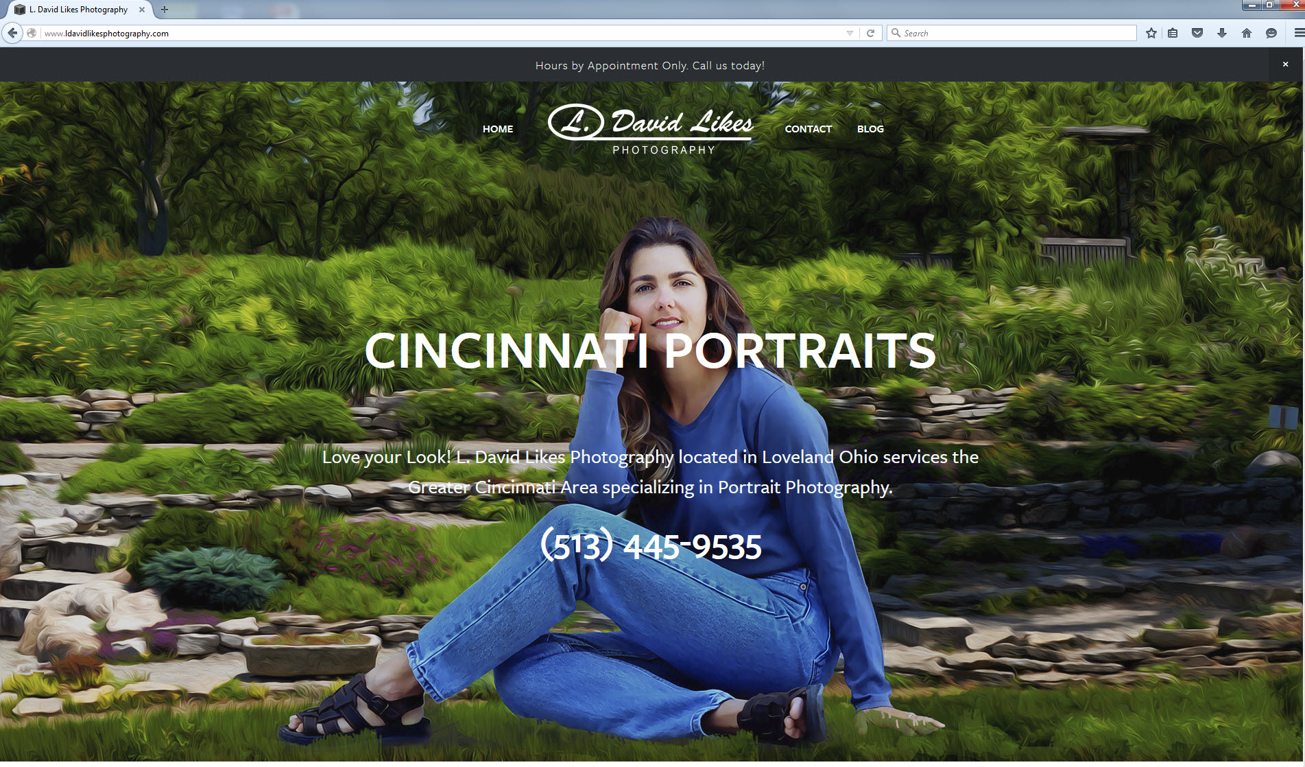
My New Responsive Website

Shown in Web Browser that I purposely scaled down in size to show how image and text auto resizes.

Seen on my Smartphone
Regardless if you are on a desktop, tablet or smartphone, a responsive website will look great! It will be easy to read and get the information quickly. This is important as 85% of consumers are now searching for local businesses online. And more and more are searching for products and services using their mobile phones.
I found this video online. It is a few years old but really explains in detail why having a mobile friendly and responsive website is so important today.
Click here to test your site. See if your website is mobile friendly?
April of 2015 Google is now punishing businesses that have websites that are not mobile friendly! Google will now lower the ranking of such websites that have not updated with the times.
So a Responsive Website is one that will scale properly to any device it is viewed on. And the reason you would want one as a business owner is for a better viewing experience on modern smartphones, tablets and other mobile devices. In addition to that, having a Mobile Friendly Website will help your SEO ranking. It will get you higher in the search engines, especially Google.
Lastly, The easier it is for local customers to view and find your information on their smartphones the better that will convert into people finding your store, products and services.
Please share this post with friends and followers. And don't forget to leave a comment below.
Thanks,
Dave Likes
